Verizon
Preconfigured Cart with Promotion Exploration
Platform
Web
Role
Experience Designer
Duration
May 6 - 8, 2026
Overview
Verizon wanted to test a promotional experience that would let customers get 4 lines for $25/line when they selected eligible devices and plans.
The offer would live on the Verizon landing page. Once selected, customers would skip the traditional Buy flow and land directly in a preconfigured cart with their devices and plans already selected.
That sounds simple.
But removing the earlier steps in the purchase journey meant the cart now had to do much more work.
Customers still needed to make important decisions, such as adding device protection, choosing perks, and bringing their numbers to Verizon, while also having the flexibility to modify individual lines.
My challenge
Design a preconfigured cart that preserved the simplicity of the promotion without taking control away from the customer
The challenge
In the standard Verizon purchase flow, customers make decisions across several stages before reaching the cart.
This promotion changed that pattern.
Customers would arrive in the cart with much of the purchase already configured for them.
One of the most important decisions normally happens earlier in the Buy flow. In this experience, there was no earlier step.
That created a new requirement:
How might we introduce the missing decisions without turning a simple promotional cart into an overwhelming configuration experience?
At the same time, customers needed the ability to modify individual lines without accidentally changing the rest of their order.
The design needed to balance two competing goals:
Make the promotion feel effortless
Keep the customer in control.
First constraint: Verizon Mobile Protect
I started by addressing the most immediate business requirement: giving customers a clear opportunity to decide whether they wanted Verizon Mobile Protect.
Rather than introducing an entirely new component or creating a new step in the purchase flow, I looked for opportunities within the existing cart architecture.
I adapted the existing Device Protection tile to include clear decision CTAs and integrated it into the Device Protection section already present in the cart.
This approach solved the immediate customer need while minimizing technical lift.
Why this approach
The goal wasn't to redesign the entire cart just to accommodate one promotion.
By working within an existing pattern, I could:
preserve familiarity for customers
minimize additional UI complexity
reduce development effort
create a reusable decision point for future experiences

Device Protection included in cart
Designing for line-level control
A preconfigured cart creates an interesting tension.
The promotion should feel convenient because Verizon has already done much of the setup.
But customers still need to feel like they can make the purchase their own.
For example, a customer might want to:
change the device on one line
select different perks
add Verizon Mobile Protect
bring an existing number to Verizon
configure one line differently from the others
The challenge was allowing that flexibility without exposing every decision for every line at once.
Solution: A focused line-editing experience
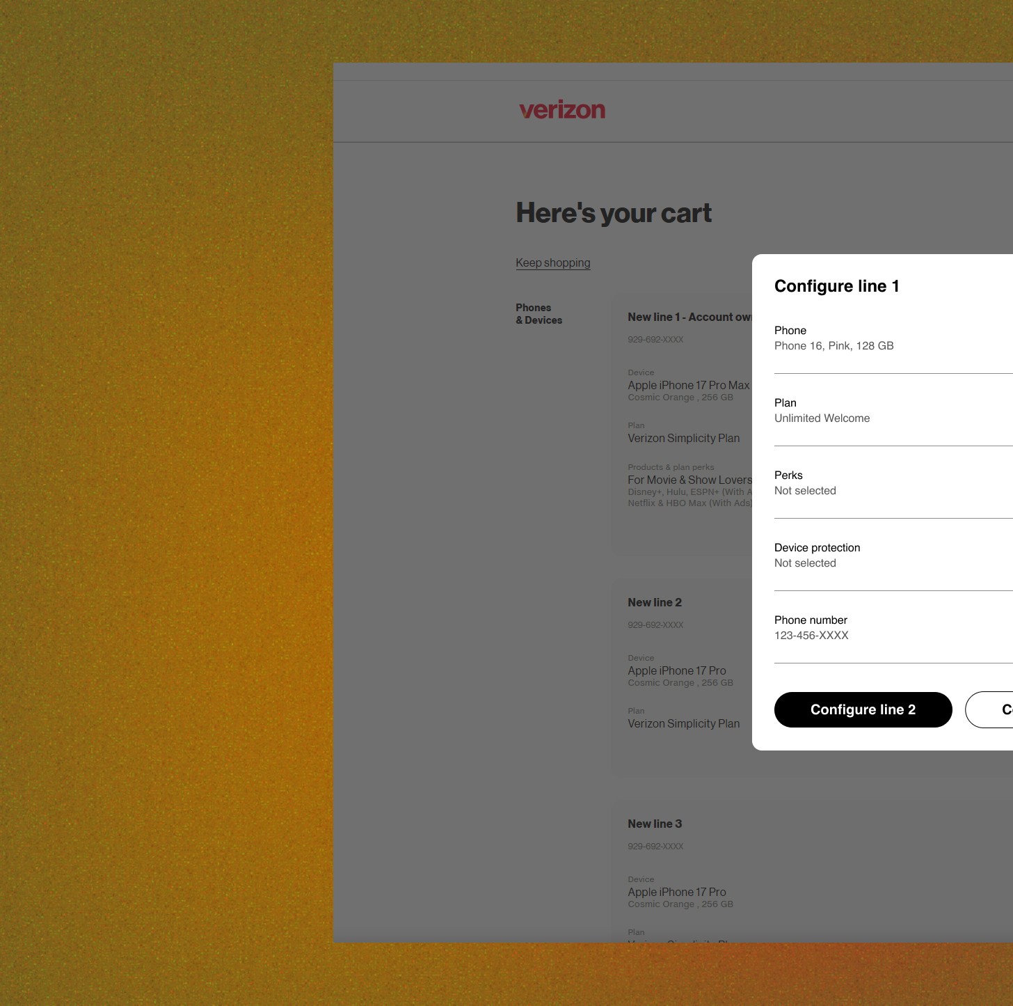
I designed a Preconfigured Promotion modal that let customers edit each line independently.
Selecting Edit on a line opened a focused configuration experience.
Instead of presenting every possible decision simultaneously, I organized the line's configuration into expandable sections.
Within the modal, customers could review and modify:
Device
The device preselected for the promotion
Plan
The plan associated with the line
Perks
Available perks and add-ons
Device Protection
The Verizon Mobile Protect decision
Bring Your Number
Whether the customer wanted to transfer an existing number
This created a contained environment where customers could make decisions one line at a time.
Designing the progression
The interaction was intentionally sequential.
A customer could:
Edit a line → Review its configuration → Make changes → Configure the next line → Return to cart
This allowed the customer to focus on one set of decisions at a time rather than scanning a large cart filled with configuration controls.
At the end of the line-level experience, the customer had two clear paths: configure the next line or return to cart and complete the purchase.
The structure gave customers control without making them manage the complexity of the entire order simultaneously.

Customer lands on cart and decides to edit line 1, opening the modal. Customer makes selections for Line 1 within the modal before returning to the cart.
Why I chose this direction
I explored the line-level modal because it created a useful separation between reviewing the order and configuring the order.
The cart could remain focused on the overall purchase:
What am I getting? How much does it cost? Am I ready to buy?
The modal could focus on the individual line:
Is this the right device, plan, protection, and number for this line?
That distinction helped preserve the simplicity of the promotional experience while still supporting the decisions customers needed to make.
It also gave the experience room to scale as additional configuration requirements emerged.
What I would explore next
The project was paused after leadership and priority changes, so the concepts did not move into development.
If the work continued, my next step would be to pressure-test the experience against the edge cases that naturally emerge in a multi-line promotional cart.
I would explore scenarios such as:
changing one line's device while preserving promotion eligibility
modifying a plan that affects the promotion
adding or removing protection after initial configuration
switching between new numbers and ported numbers
handling incomplete line configurations
communicating when a change causes the promotional price to change
managing dependencies between lines
I would also partner with developers to validate the modal and configuration model against the existing cart architecture and determine which parts could be supported with the lowest technical complexity.
What I learned
This exploration reinforced something I find especially interesting about e-commerce design:
A “simpler” entry point can create more complexity later.
Preconfiguring the cart removes work from the beginning of the journey, but it doesn't eliminate the decisions customers need to make.
The design challenge was therefore not simply to create a promotional cart. It was to redistribute complexity so that customers could take advantage of the convenience of a preconfigured order without losing the ability to make meaningful choices.
The strongest direction came from treating the cart as a place to review the purchase, while giving customers a focused space to configure each line.
That separation kept the promotional experience simple without making it rigid.